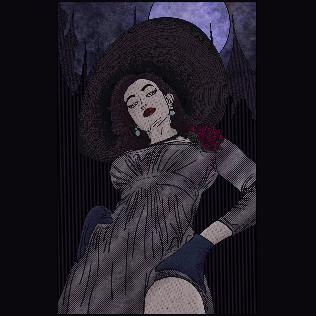
Lady Dimitrescu Resident Evil Village
Something i made for the memes, originally titled “Tall Vampire Lady” with a dialogue option of “step on me”, i made this before the release of the game, when the Lady Dimitrescu memes were ripe and the Resident Evil Village cosplays were booming, for this Resident Evil Village Fan Art, i used a cosplay by Danielle Denicola and a screenshot of the vampire castle for the background of this artwork. I have a bunch of Resident Evil art ideas, but more often than not are just memes, for instance i wanted to draw the woman yelling at cat meme but with Ethan Winters as the cat and Lady Dimitrescu and her daughter on the other panel.
This one is targeted at all the step on me memes, hence the angle i chose for this Lady Dimitrescu artwork, now i am no rule 34 artist, but i do partake in meme creation.

Visit Artyom's Nightmare Poster
I have always loved the Metro 2033 franchise, i even read all of the novels from Metro 2033 to Metro 2035, it kind of made the Metro 2033 game less pleasant as i noticed what was cut from the story, but alas, amazing franchise, and what’s even more amazing was the trailer for the Metro Exodus game, titled with the same title here, Artyom’s Nightmare.
Now that trailer, i don’t even think calling it a trailer would give it justive, it was a piece of art, some deep psychological horror of story telling, i found out afterwards that the developers contracted a studio to create that trailer for them, but it doesn’t take away from it anything, matter of fact i even found out that the developers themselves loved the trailer as much as i loved it, justifiably so.
So, the backstory behind this Metro Exodus Poster aside, how did i make it and what was my inspiration, the inspiration was straight out a scene from the trailer, with a boat going down the river and on it is Anna Miller holding a baby wearing a gas mask, you can’t make this shit up, so, i now have the idea for the composition and have to think about the art style i am going for, i decided i will make one of those “Visit x” designs that Mathiole one of my favorite artists always does, and not to complicate things i decided to only use 4-5 colors, make it simple/minimalist, i started with Anna from Metro Exodus and slapped a boat afterwards and then had to think of what color to use for the boat, how will i differentiate the boat color from the river color, not to mention the sky, it was a tedious task of test and error and quite the number of crazy lines and textures intertwining to get the feeling just right, i also tried to draw the waves/water instead of basically have a solid color with no detail as you can see here, but it didn’t look that good so i scratched it. I was aiming for as much Minimalism as i can, as part of my own journey on finding out a style that clicks with me.
Story of my life aside, i hope you like this Artyom’s Nightmare poster of Metro Exodus.

A Nightmare in Lavender Town: Gengar's Revenge
The horror movie reference aside, this here is a version of my Gengar in Lavender Town Pokemon fan art, the 5 color version, it was initially made for screen printing, however, i ended up actually liking this more than the original, even though this looks like a watered down version of my Ghost of Lavender Town design, once again reinforcing to me that less is more when it comes to minimalism.
I want to create more Pokemon artworks with this style, can never have enough of that evil Gengar smile, but then again maybe i should move on to the different types, this artwork relied on a single type and a location where that type is infamous for, it might be cool to do the same for the other Pokemon, like red and fire, green and grass, and keep each of them contained to a 5 color pallete like here, could turn out as an amazing series of Pokemon illustrations.

Surfing Gengar
Something i made after feeling bad for making the Surfing Pikachu Pokemon artwork, i needed to reignite my own imagination and repent for my lack of originality, so i drew Gengar surfing on the great wave off kanagawa, in hindsight i probably should have changed even more, the sky color, the shape of the clouds, turn this into a horror story, rather than just Gengar having fun, but then again hindsight is 20/20.
Also, how is Gengar, a ghost, surfing? so many questions, so little answers, running out of time.

Cyberpunk SM1L3
At some point in life i wanted to create a series of original artworks with a common character between them, that character was supposed to be named the “smile”, an entity with no facial features or form rather than, well, this specific smile, after some time i realized i am just being an edgy teenager and decided not to continue the series, this was the third entry to it, the focus of this artwork was for me to create something original in the Cyberpunk genre.
I had drawn inspirations from multiple things for this artwork, like Cyberpunk 2077, Akira, Ghost in the Shell, Bladerunner and last but not least Ruiner, as you can tell by the “KILL YOU, KILL YOU” on the smile mask/face, it’s quite an underrated game in the Cyberpunk genre to be honest.
My biggest obstacle in creating this artwork was the lighting, for instance the “smile” character was supposed to be basically a glitched appearance on a large screen behind the Solo character in this artwork, but i had to figure out how to implement that, if i make the screen too bright it would look bad, not to mention i have to emphasize the light scatter from the screen on the rest of the artwork, do i make the screen dim? what about the glitch effect? i tried glitching the cyberpunk smile character, but it just didn’t look good, so was the bright screen effect, so i just made a faintly lit and told myself “just don’t think about it”.
It was something i should have probably figured out at composition stage rather than by the middle of the artwork, but i’ll get there eventually, practice makes perfect.

Astronaut Watching a Movie
Also titled “Space Cinema”, it’s an artwork Inspired by the Stig eating popcorn meme from Top Gear, and well, another artwork by the artist Xision Wu, depicting an astronaut on the moon watching a movie while “eating” popcorn, hence where this astronaut watching a movie idea came from.
Part of me wanted to have the background as some sort of galaxy, portraying he is actually in space or as if the entire cinema is detached and is in fact floating in space, however after some playing around i don’t think it would have turned out well, not with my current angle and composition anyways.
It’s another artwork on my journey to grasp the true meaning of minimalism, hence the simple shading and details in this artwork, there is also a black and white version of this that looks quite unusual and i love it.

Dark Souls Stained Glass
Something i made for a themed art challenge, the theme was “stained glass” and i was at a point in life where i really liked Dark Souls, like REALLY, i think i had just finished Dark Souls 3 and wanted to create some fan art for it, it’s an amazing game anyways.
I was inspired by the eclipse at the end of the game where you fight the Soul of Cinder and had googled a bunch of stained glass artworks from churches and the such, so now i had a mirror/shape i can work with, and was a bit more familiar with the style, i made the eclipse to be the focus of the image and let me imagination run wild, Lothric Castle from Dark Souls 3 was made to be the background of this artwork, the clouds ended up being a crazy interweaving pattern, and the characters i ended up adding were the Ashen One portrayed on the cover of the Dark Souls 3 game, the Fire Keeper from the Firelink Shrine in Dark Souls 3, and lastly my boy Knight Artorias the Abysswalker from the first Dark Souls game, figuring out how to draw them while maintaining the stained glass style was the hardest thing to do in this artwork.
I eventually made 2 versions, a rough colored version with a bunch of grunge effects to mimic an authentic stained glass feel, and just a smooth black and white version shown here, the black and white version looks much cooler in my opinion.

The Hall of Masks - Hollow Knight
The second artwork of my Hollow Knight fan art, inspired by the Hall of Faces from Game of Thrones, and well, the fact there is no shortage of masks in Hollow Knight.
When creating this, i simply remembered the stone walls from the Game of Thrones show where they keep all the “faces”, and decided to recreate them with some insect patterns and shapes from within the game, i also felt it was missing something so i created a stone statue of The Radiance Moth from Hollow Knight as part of the same wall stone contraption that holds those Hollow Knight masks, now i did ask myself why do they even wear masks but i will not question the lore of the Mask Maker.
After deciding the composition for this Hollow Knight artwork, i needed to decide what Hollow Knight Masks will i put in the artwork, the protagonist, the literal hollow knight was a given and so were Hornet, but after that it was just to my own preference really, Nosk made the cut because he was a literal son of a bitch, the Primal Aspids due to them being the enemy i died to the most, the Pure Vessel because that’s a very cool looking mask, the guy has his own statue in the City of Tears, Troupe Master Grimm because that was a nice DLC, Zote The Mighty for being a meme, and the rest were just to fill space like the Elderbug and Iselda.
Hollow Knight at the end of the day is a great game and i can not wait for Hollow Knight Silksong, i might do more fan art of the game when i have time, i do need good ideas though.

The Name is Archer
Sterling Archer.
I made this after watching literally every season from the Archer TV Show, and then realizing nobody, and i man nobody, made a James Bond crossover with Sterling Archer, i was extremely confused to be honest.
two secret spies, one is serious, one is basically making fun of the other, the similarities are immense, and the fact nobody cared enough to do this mashup ended up in me doing it. It’s a very simple concept anyways.
I thought about many different poses of Archer, some mimicking the intro of James Bond with him aiming his gun at the spectator, and some are just different poses from the Archer show itself, eventually i settled down to Archer holding a gun and an alcohol flask, as it’s very fitting for the character of Sterling Archer, i also threw in “Danger Zone” next to the gun as an inside joke.

Rapture Radio Bioshock Poster
Rapture Radio, a Bioshock poster design, it has to be mentioned that the Bioshock franchise is one of my favorite game franchises of all time, i am a huge deep sea/marine biology nerd, and the prospect of a city underwater, not to mention set in the 60s or 70s is something extremely intriguing for me, i was an immediate fan of the setting.
So, fast forward a few years, i already played the games countless amount of times, and finally decided to play them again, however, this time, i will take something from each game and draw it, whether it was a poster, a scene, a specific moment, or even a feeling.
Ok, my own pretentiousness aside, this is just the aforementioned, it’s a Bioshock poster from the first Bioshock game, depicting Rapture Radio, they had decent music, just open Spotify and check out the Bioshock Radio playlist.
I made many other Bioshock poster designs and fan art, however most were simply done as practice, just for fun, or are simple shirt designs, i didn’t feel the need to put them on the site, you can however take a look at them on my online stores, my personal favorites are my recreation of the “Evolve Today” slogan with the usage of the plasmids as part of the design.

Franklin Booth X Darth Vader
There was a themed art challenge with the theme being Pantone colors of the year, for the year 2021, those were Illuminating and Ultimate Gray, combined with the fact that i was already working on a Retro/Vintage art challenge i decided to mix the two.
So here i am, trying to make some pop culture art using 2 colors and in a vintage style, and what’s trending these days is The Mandalorian and Star Wars in general, so i took inspirations from one of my favorite ink artists Franklin Booth and used one of his drawings to try and learn from the master.
The Drawing i used was an artwork depicting soldiers going to war with the shadow of the Grim Reaper portrayed on the clouds, with the composition of what i had to draw being obviously clear cut after seeing that, Grim Reaper = Darth Vader, and soldiers = Stormtroopers, all i had to figure out was, how to draw lines like Franklin Booth, someone who is a master of his craft, after some pondering, and a bit of tinkering, i realized that this master study is almost impossible in my time frame, the lines are too clean and my skill is inadequate, not if i want to Franklin Booth justice.
So, i just went with it, i knew i could never match the skills nor the proficiency, but at the very least i will try to match the general feel of the style, try my best at mimicking his composition, and i was not happy with end result to be honest, but with the time frame i had, it was probably the best i could do.
I kept the usage of the “Illuminating” pantone color to a minimum and used it to accentuate the random Darth Vader in the sky, i added some dark grunge effect as a background for contrast and tried to portray a feel of grandeur from Darth Vader, rather than fear.
For the Stormtroopers, it was a bit tricky, i felt like it was hard for me to properly draw them with the style i started the artwork with, i just couldn’t figure out a way for me to make them properly noticeable, especially with the angle i was going with as i had to draw them from the rear view. In the end i just made a rough sketch of them, worked on the contrast and lighting for a bit, and tried to forget this ever happened.
With that being said, that was the end of me trying to create Star Wars fan art, the franchise have enough fans and better artists than me to be frank, it was a good experience at a vintage style nevertheless.

Riff N' Tear - Doom Eternal Poster
You guessed it, another artwork, another themed challenge, i should really stop doing these and just draw whatever comes to mind, i don’t know, it could be my usual artist block or lack of imagination that leads me eventually to be motivated whenever a theme exists.
For this artwork the theme was fake band names, there were a few ideas, however i recall seeing a Reddit post on how there was a guitar in the game, multiple ones actually, so i decided to use Doomguy the Crucible guitar and a random balrog in the background as my composition for this next design.
The name for the band was a community effort to be honest, as i asked a bunch of fans what could be a good name, i got plenty of good ones but eventually settled on Riff N’ Tear as a reference to the infamous Rip & Tear slogan the game franchise is known for.
The Doomguy blasting his guitar on top of a mountain of bones was actually inspired by one of Doom Eternal official wallpapers, where Doomguy is just standing on a mountain of corpses with his sword out, yes i know how that sounds as i write it. With that out of the way i kind of felt the artwork, or is it a poster? it’s a fake band no? never mind it is a poster, i felt the Doom Eternal fake band poster need something more, the Riff N’ Tear text by itself with what i had so far didn’t look that good, so i decided to add some demonic figure at the back or as a silhouette, for that i decided to use one of my favorite demons in media, the Balrog from Lord of the Rings. To be honest i didn’t think many people would realize that i used it, but a number of people caught the reference right away, in this so called fake Doom band poster.

IMPOSTOR Poster
My second attempt at creating minimal posters using the Obama Hope poster style, it’s a mouthful, but i am not sure if it has an actual name, in this one i just used a trendy topic at the time, and that was the game Among Us, i never got into the game myself, it is great for meme content and looks fun, but i don’t have many gamer friends to be honest, most of them are a bunch of 20 years old boomers. I suppose that’s what happens when you become a doctor, most of our colleagues were rendered lifeless zombies by the time of our graduation.
I had multiple ideas for this Among Us Impostor poster, i had to decide if i should draw the humans with my own style or use the minimalism the game itself has to create this artwork, to save myself some time, and to stay authentic to the game, i just went with the art style the game already has. There is even an added joke that i am not even sure anyone can read written below the “impostor” text, it says “red was not an impostor”, referencing how the red crew mate was always the suspicious one in the meme lore, now the question i leave you guys with is what is the color of the “character” i drew in this Among Us Impostor poster, and what does all of this really mean. I know, the plot thickens.

Tallneck Poster
Some fan art i made for the game Horizon Zero Dawn, a rather simple design implementing silhouettes and double exposures. Tallneck is my favorite creature/machine design of the bunch and i wanted to draw Tallneck in a minimalistic way as that seems to be my current trend, the general shape was fairly easy to draw, but then it felt like it needed something, so i decided to make it a double exposure artwork, it was tricky at first because of how longitudinal the whole thing is and the lack of space to draw the silhouettes in a meaningful way, however, in the end i did manage to fit in some characters and machines from Horizon Zero Dawn.
The machines that made the cut from Horizon Zero Dawn are: Tallneck, Behemoth, Watcher, Sawtooth, Glinthawk, Longleg and Corruptor.
Obviously Aloy from Horizon Zero Dawn is also in it, as why wouldn’t she be, i hope you like this Tallneck poster design.
Random
A few of my works that didn’t reach the Portfolio status, though i love them nevertheless.